
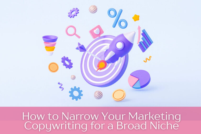
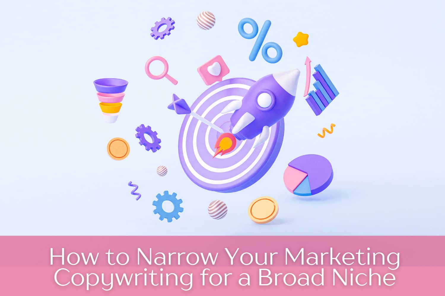
As someone who has been creating marketing copywriting professionally for over 30 years, I can tell you that one of the most difficult things to do is write to (what I call) a split audience.Have you
Continue Reading
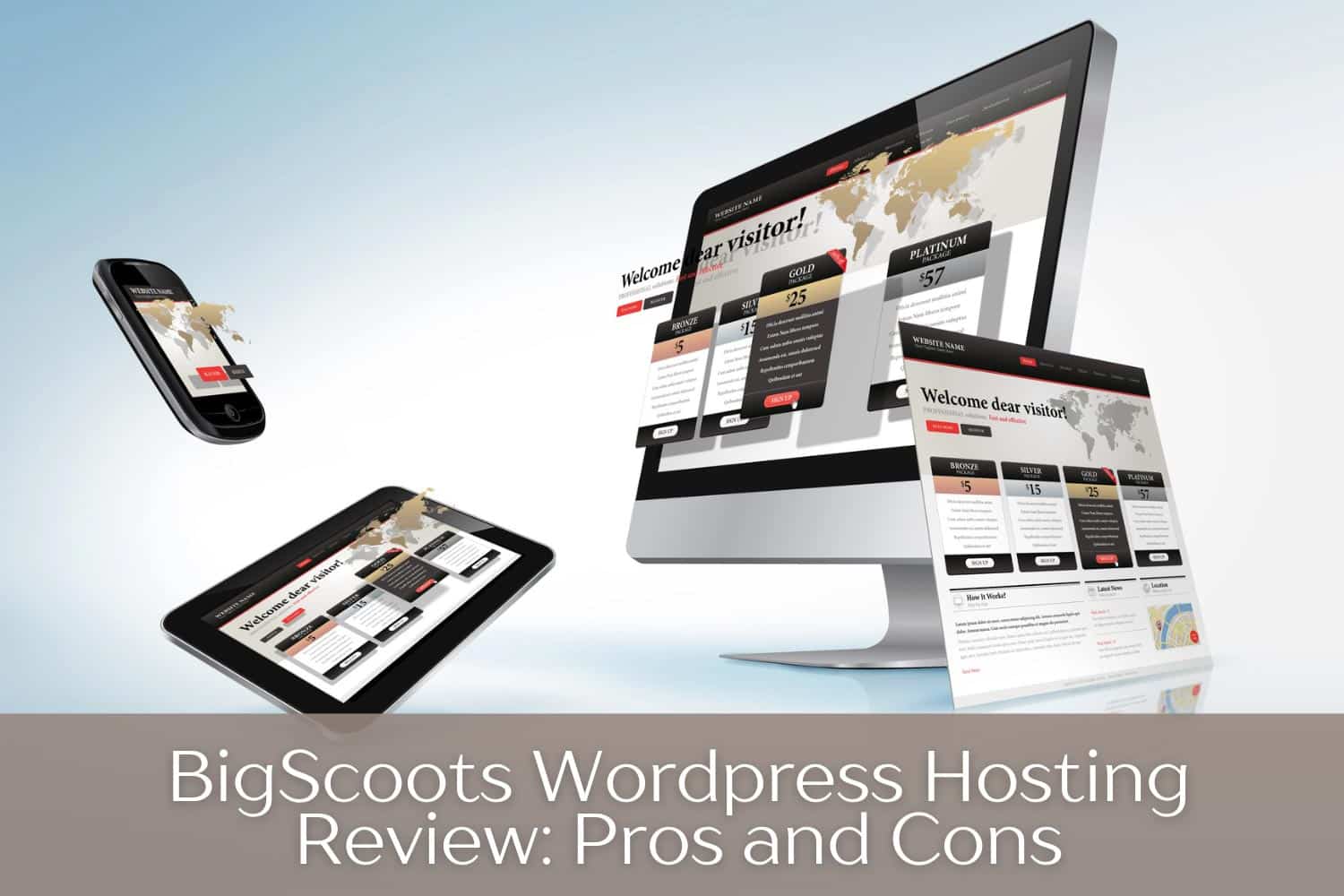
BigScoots WordPress Hosting Review: Pros and Cons
You know it’s time to switch WordPress hosts when you start getting semi regular emails warning that resources are
Continue Reading
Creating Printables: 5 Printables / Downloads Proven to Sell with Low Competition
While selling printables and digital downloads on Etsy continues to be a fantastic way to earn recurring, passive income
Continue Reading

Blogging to Make Money: 5 Unique Ways to Monetize Your Blog
The question for almost every blogger is, “How can I monetize my blog?” After all, for the majority of us, we are
Continue Reading

Overcoming the Overwhelm of Passive Income Streams
Let me share a combination of a few emails I received recently and my replies. If you’ve been trying to create passive
Continue Reading

34 Easy Digital Products to Sell
When it comes to making money online, one thing is sure. You need a continual supply of products (I much prefer digital
Continue Reading

Passive Income Ideas: Strategies For Making Money Every Day
Who wants money flowing in day after day whether you work every day or not? Yeah, I thought so.
No, it’s not an Internet
Continue Reading

11 Best Email Subject Lines from 2023 and Why They Work
While email marketing is my absolute favorite method for earning, I admit that things have gotten more challenging as
Continue Reading
Get More Readers & Subscribers by Turning Your Blog into Kindle Books
You know, I used to do this years ago, and I made decent money. But I got out of the habit. Something I’m going to
Continue Reading

10 Etsy Alternatives for Printables Sellers
Do you think Etsy is getting way too crowded? Wondering if you should be selling on another site? Are there alternatives
Continue Reading
