

 Above the fold; in a lightbox; at the end of your blog post; on your landing page. The list of “must-have” opt-in form locations seems to get longer every passing year. In an effort to build your prospect list, you diligently comply.
But are all those forms doing their job? Or is poor form design hampering your efforts?
Reduce the Friction
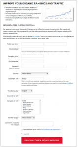
It’s probably beneficial to know your prospect’s zip code, or the number of employees he has, or his annual revenue. For every piece of information you request, though, your reader stops to think, “Do I really want this company to have those details?” Remember, he doesn’t know you yet, and you’re asking him to trust you with personal data. For many people, that’s enough to make them click away, or – perhaps worse – provide false data that then becomes meaningless to you.
Instead, ask for only the information you genuinely need at that point in the relationship. In most cases, an email address is the absolute minimum.
Once you’ve received permission to contact the lead and you earn a bit of trust, you can ask for added information in the following steps. Once your prospect is on your mailing list and has had the opportunity to interact with you for a while, he will be much more likely to share those personal details. Public information about his company can easily be found and added to his record, as well.
These simple changes helped HP improve their conversion rates by 186% as reported in a case study by Marketing Sherpa in 2012. In another study, a shorter form (fewer fields) reduced the cost per lead by more than $10, so it pays to carefully consider just how much information you need at the start of your relationship.
Benefit-Driven Call to Action
Take a hard look at the button on your form. Chances are, it says something like “sign up now.” Here’s the problem: No one wants to “sign up” or “subscribe” or “register.” We want to get something, not do something. Sign up sounds like work. Your call to action – the words on your form button – needs to convey the benefits of clicking that button:
• Get Instant Access
• Download Now
• Get Your Free Gift
Those are calls to action that sound fun and fast and helpful. Those are the buttons that get clicked.
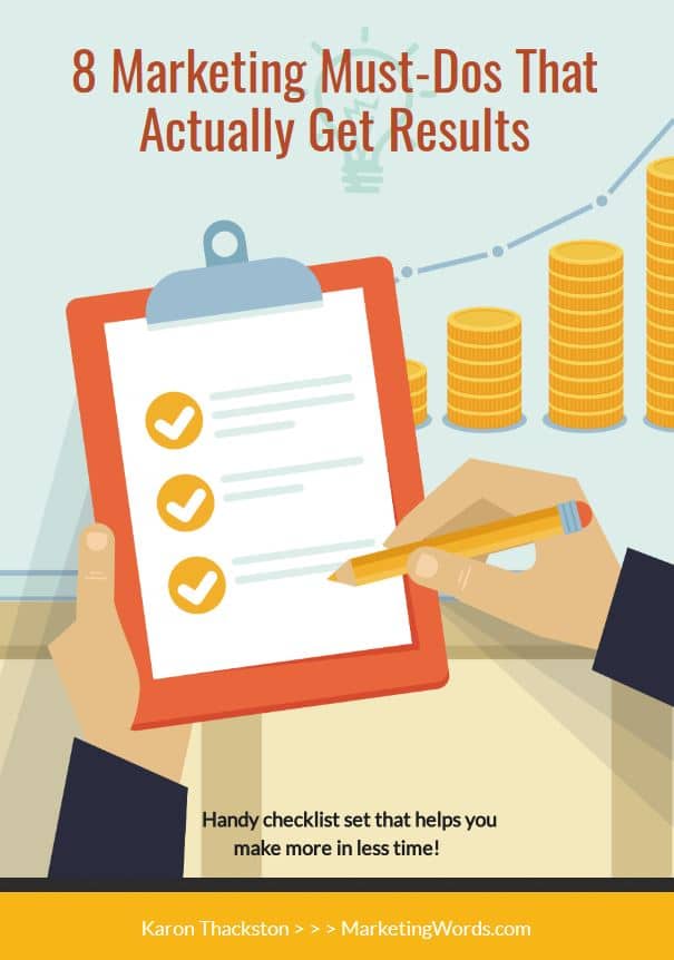
Download your…
Time-Tested, Proven Marketing Strategies
That Actually Work
A handy checklist set that helps you drive traffic, make more money & spend less time doing it.
I understand that I will also receive weekly articles & videos plus periodic discounts, product notices & more. I can unsubscribe at any time.
Avoid One-Size-Fits-All Forms
Does your market span multiple industries? If you’re segmenting your list so you can provide relevant information to each prospect, good for you! If you’re asking your prospect to self-select his list preference with a checkbox on your form, well, that’s going a little far.
Instead, create a different form for each list, and use that form where pre-qualified readers will see it – at the bottom of a blog post, for example, or on an industry-specific landing page. Since only those in a particular industry or market are likely to visit the page, there’s no need to make your reader choose. Even better, he won’t feel as if you’re trying to be everything to everyone.
Making it difficult for your prospects to get on your mailing list means they’re more likely to find their way to your competitor instead. Keep it simple, ask for only the information you need at that point in the process, and be sure your prospect knows “what’s in it for him,” and then your lead generation efforts will pay off.

Want more tips for creating a marketing plan that helps you accomplish your goals? Sign up for my free 3-part video series: Intentional Marketing Revolution: Creating a Marketing Plan with Purpose.
I liked your subtitle “reduce the friction” Here’s my question…what’s better a 21 day e-course where new subs get a follow-up email every 3 days or an ebook they can download instantly? I’ve been offering the e-course for several months however get few conversions.
Herman, you know my answer to that :)… test it! It may not be that the format is an email course… it could be the material in the course, the upsells, the price… 100 things. Look at your open and click rates for each of the emails in the series. If you see a high unsubscribe rate after one particular one, you’ve got a hole that needs to be fixed.
Put the info into an ebook and test it that way. You’ll still need to write a follow-up series to get people to read it. Most people download a free ebook and forget all about it. 🙂
Hi Karon, you make some really good points in this article. I especially think alot of websites miss the mark on generating benefit driven calls to actions. Providing actionable wording within your CTA is important but also a key point people need to understand is to always test and monitor how well your CTA is doing. Don’t be afraid to mix it up!
True. The CTA button copy for forms is vital as is the copy in the form itself.